Wilberforce
The Role
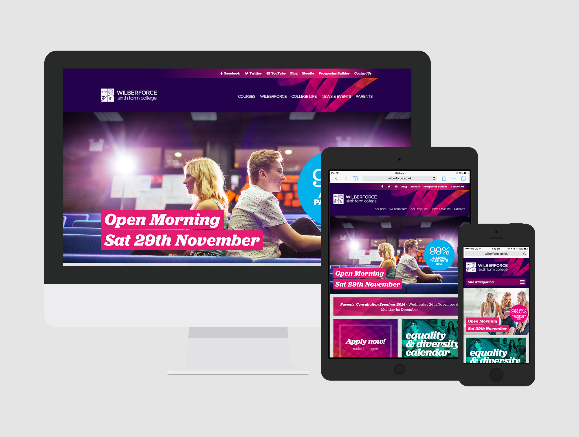
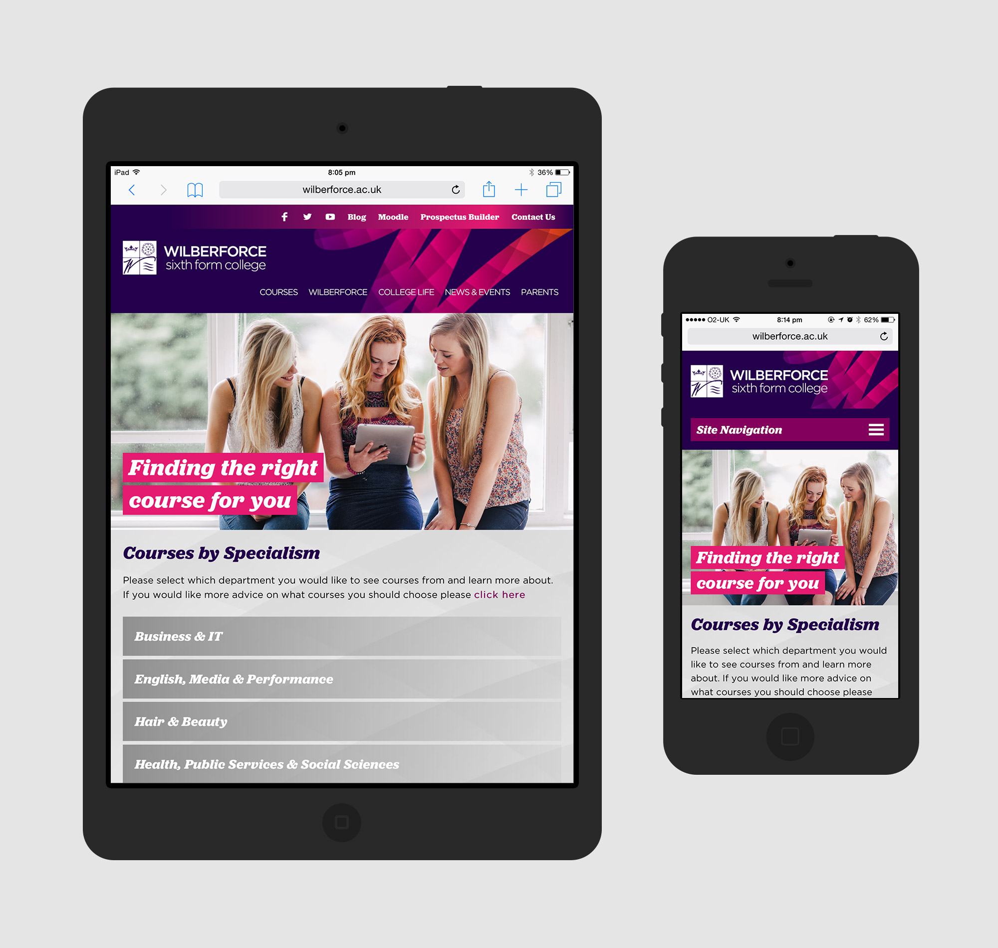
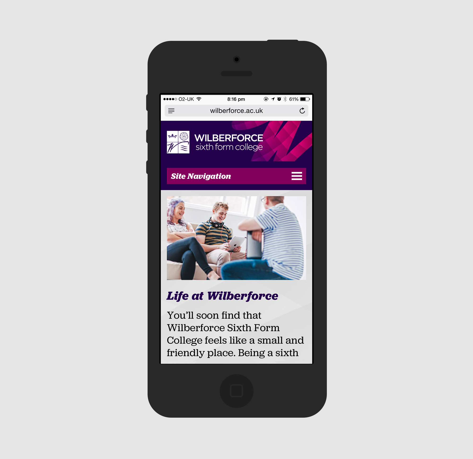
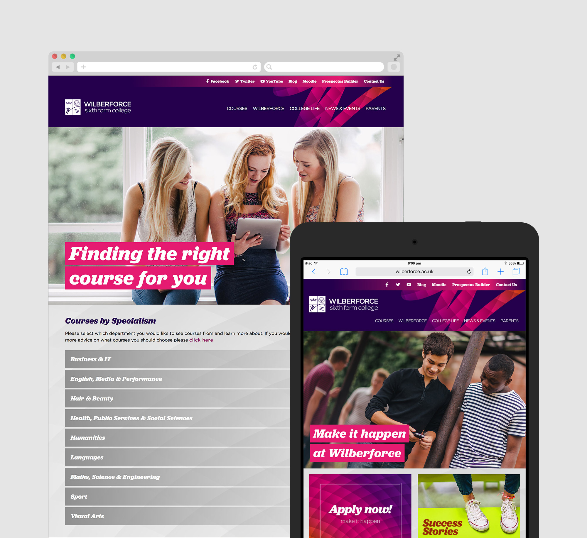
Local college Wilberforce wanted a fresh look to their website to stand out above the other colleges in the area. They also wanted a fully responsive site to encourage their students to connect with the site more on the go.
My role on this project was to design and build the new site. The clients previous website looked hugely dated but the team at Strawberry completed a great rebrand for their prospectus and it was my job to follow this through to the digital side.
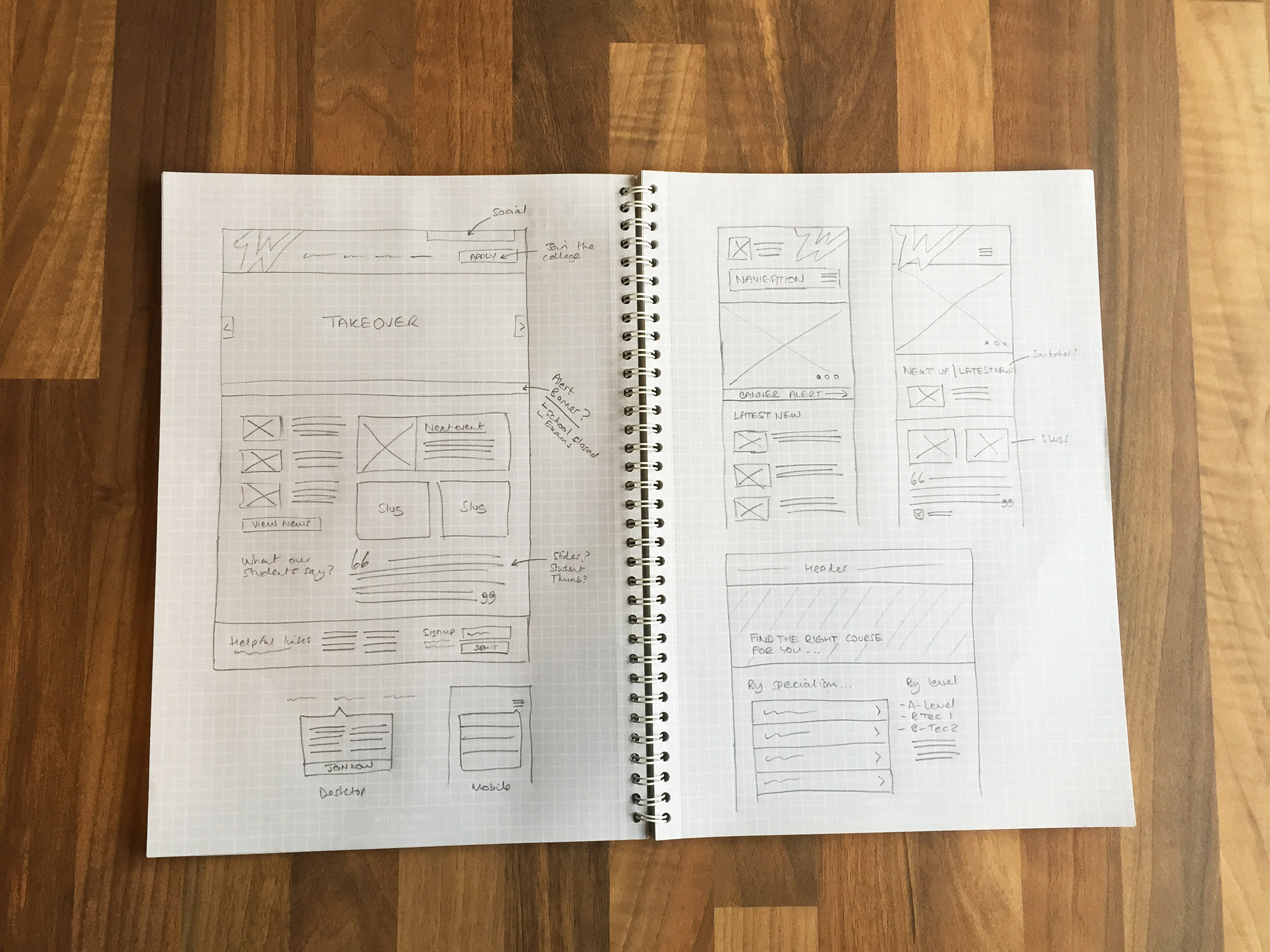
Design
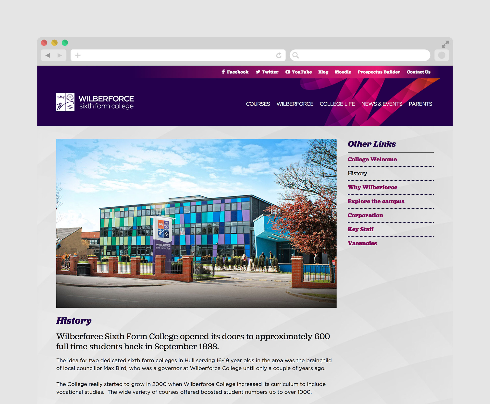
The Wilbeforce brand contains very strong vivid colours (pinks and purples), and it was important that I didn’t overuse these too much because I didn’t want to distract the user away from the key content they were trying to access.
With the site containing a lot of content, such as course information, parent advice, student advice as well as a lot of information about the college itself, it was key that this was well organised to ensure the user can find what they want quickly. This was achieved by breaking up the site into five key content pillars, with well thought out titles to prevent confusion.
The site was designed mobile up to ensure that no matter what device or resolution you were browsing the site from, the experience was still as good. We picked two great typefaces (Jubilat and Gotham) which both complement each other and offer a great reading environment.
Outcome
Since launching earlier this year, it has been a huge success, with an increased number of applicants wanting to join the college and a huge increase in mobile traffic (over 40%) compared to the previous website.